Ancillary texts such as posters and reviews are primarily created and distributed to advertise the main product, such as a film. With this in mind, I created a poster and Benjy made a review using the same style to advertise and express the films forms and conventions.
The film, poster and review have been created to intertwine with each other. The poster was created to effectively give the reader an understanding of the film's genre and narrative. The review then specifies what did and did not work in terms of our intentions, it also gives the opinion of the film as if from an outside source. The combination of these three products helps form an overall summary of what to expect from the film, and whether our target audience may or may not enjoy it.
As you can see, I used the same font for both the film and the poster's logo, this adds consistency between the themes of both texts. However I used a different colour for both font, this is due to different colours making sense and working based on the images surrounding the logo. Using the same logo gives viewers of the poster a better understanding of what to expect with our film.
The poster addresses the audience as a form of reaching out to them. This is done by Callum looking toward the camera, so the audience can empathise with him. The review then addresses the film's mistakes alongside the humour that worked. Both of these together help the reader understand what to expect when going to see the film.
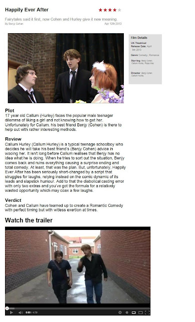
The following review was made by Benjy Cohen (www.clapperboardcreations.blogspot.co.uk).
The review was deigned to communicate the films aims and conventions to readers. The image used is the section of the film that the poster is based on, this was done to link the three Ancillary texts together. As you can see, the review focuses on the good and the bad points in the film while displaying the Genre, this gives readers a strong understanding of our film's forms and conventions while also being used a good advertising.


